at Six Red Marbles
The Challenge
A large Education Client was looking for a design & development partner for the creation of e-learning courseware. As a proposal, we were tasked to create two complete, standards-compliant, interactive, engaging, high fidelity e-learning lesson prototypes, and deliver them in 6 weeks.
I was brought in to do the UX/UI design and worked within an Agile development environment.
The two prototype lessons:
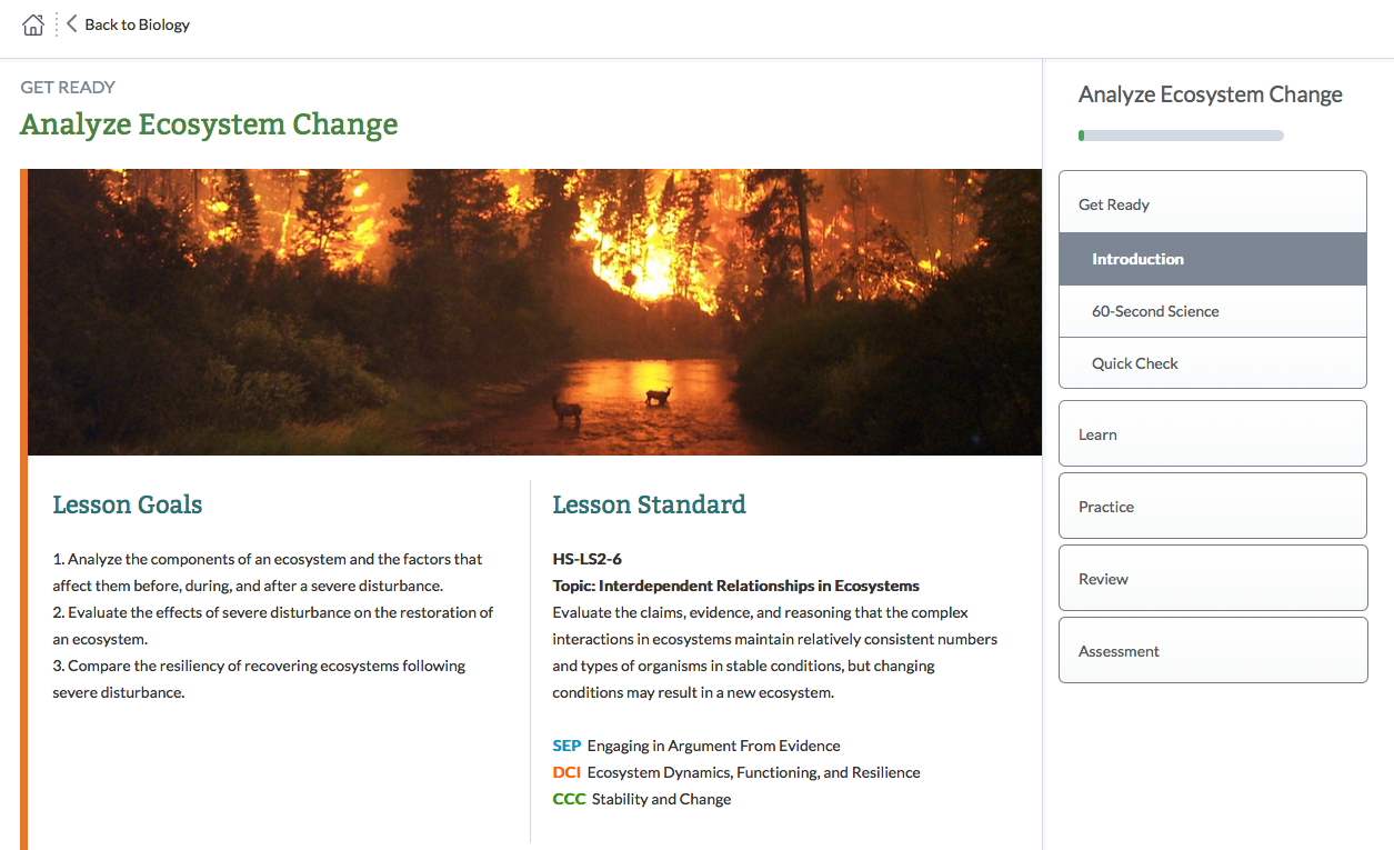
- High School Biology: Ecosystem Recovery
-
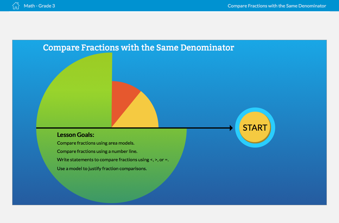
3rd grade Math: Working with Fractions
The Process
Early on through user testing we identified some general assumptions and specific challenges for each product.
Both user groups (3rd graders & high schoolers)….
- Are digital natives with fundamental computer/tablet skills and understanding of HCI conventions.
- Are to some degree desensitized to digital noise (ads, active visual distraction).
- Expect & respond to visual, interactive content (and inversely, can get bored with large amounts of static content or text)
Specifically, 3G users…
- Identify with simpler, less sophisticated illustrations where imagination fills in the details (ie, line drawings, simple shapes)
- Are not afraid to explore (clicking on things for unknown results).
- Have limited cognitive reach to connect multiple concepts. Multiple small cognitive steps are required to make these connections.
Specifically, HS users…
- Don't like to read.
- Are less likely to explore or go off-course. They would rather get through a lesson as quickly as possible. Only if they are engaged will they explore and then only when the "scent" is clear for what is behind a button/link/image click.
- Expect the "answers" to be provided by the content rather than synthesized from the content.
The development of the 3rd Grade Math prototype is showcased below.
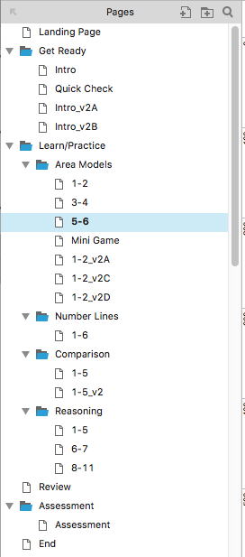
Initial IA by SMEs and Client system requirements allowed me to create block wireframes & lesson structure while content was still ambiguous.
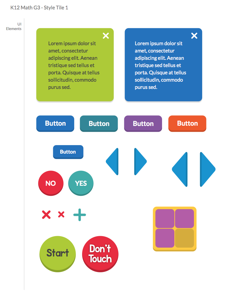
3G age-appropriate Illustration styles & typography were explored and presented to Client.
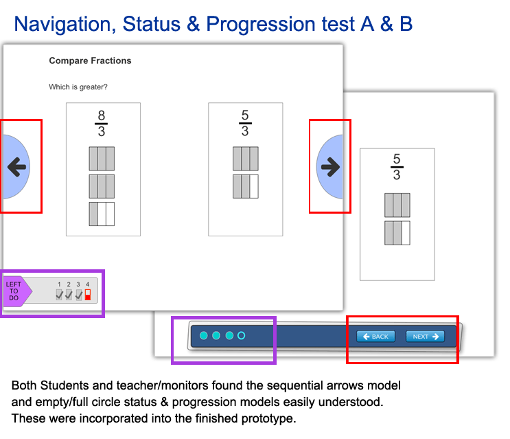
We needed to lock down the most intuitive navigation model for 3G users. Requirements for displaying an intuitive lesson status and progression for teachers were an added challenge. For this we turned to user testing. Limiting visual design to a minimum, I created interactive wireframes of two navigation & status models (outlined in red & purple). Presented to 8 users, the results identified certain elements we incorporated going forward.
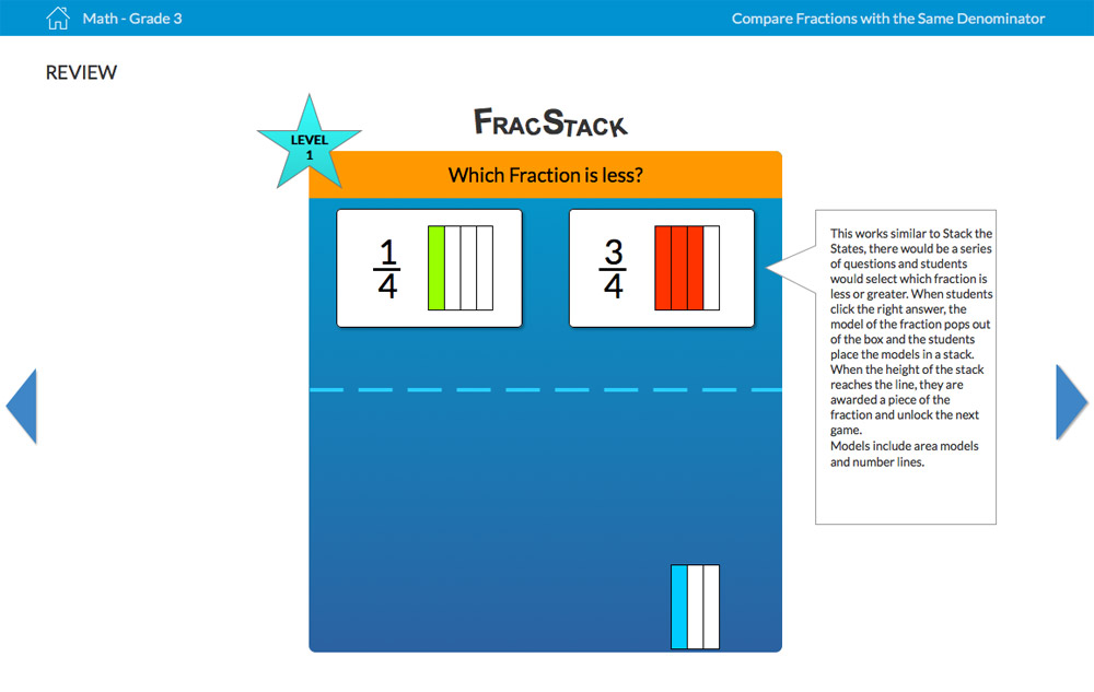
As content was refined, iterative wireframes were produced, spawning more thought and evolution.
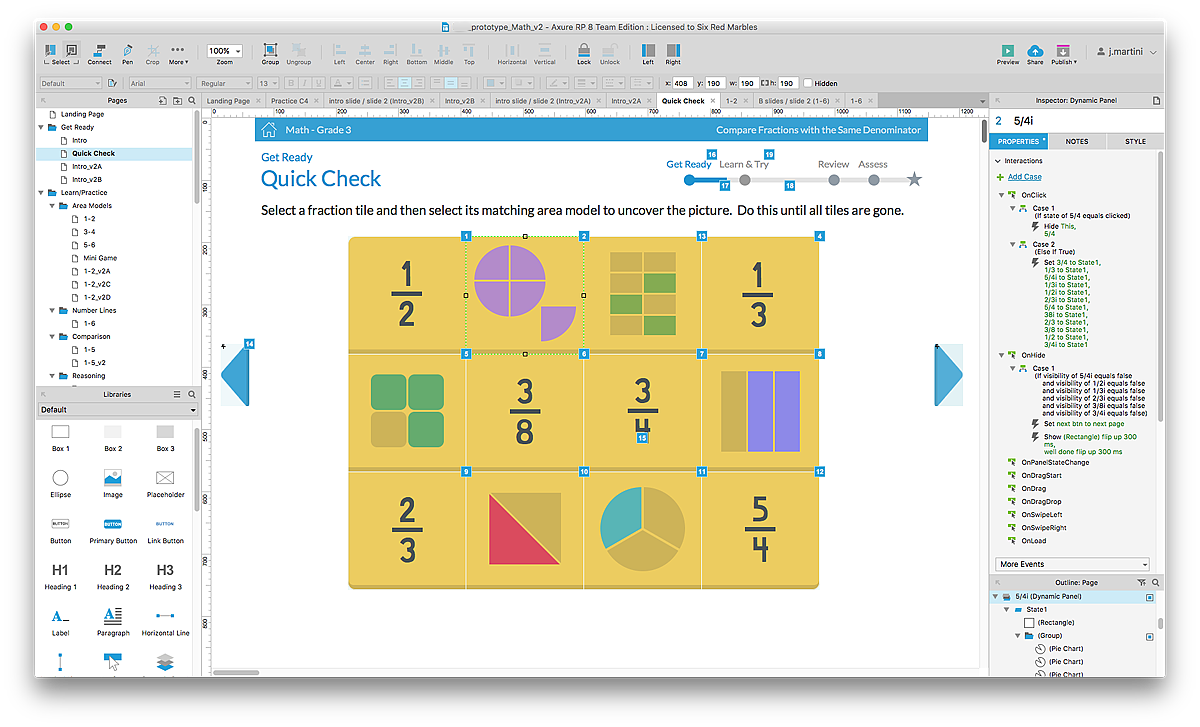
Interactive simulations were created, first in low fidelity to test interactive coding, then with actual data, artwork, and visual design.
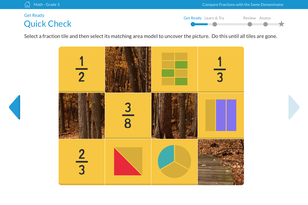
User testing of midterm product validated many design & interface elements while identifying other content inferences, which were then redressed.
The Result
On-time delivery of high fidelity, interactive Axure prototypes to client were very well received and negotiations for full courseware are underway.